CLAIRE'S CAFE
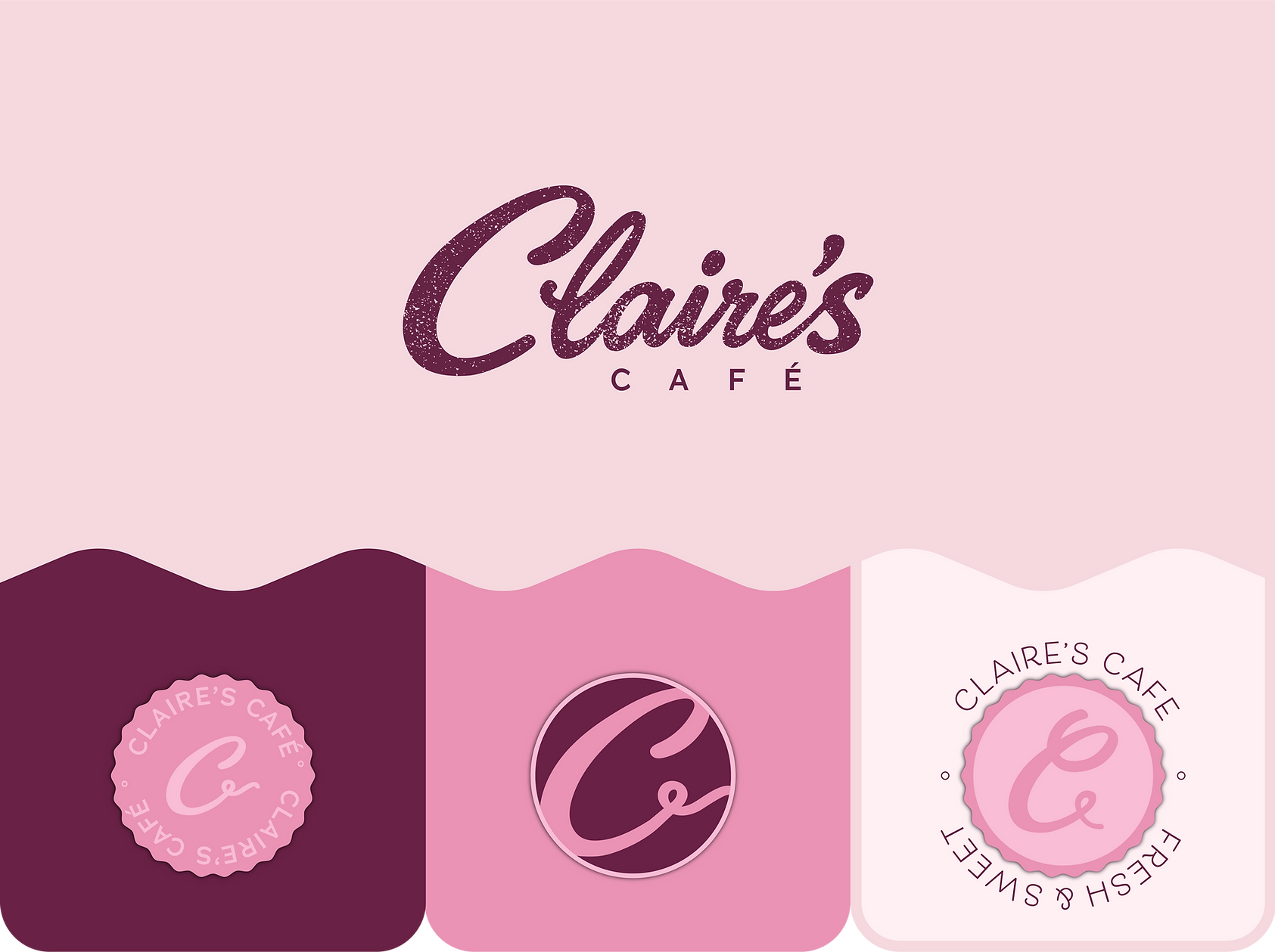
Claire’s Café is a bakery-inspired cosmetics concept designed to blend the sweetness of dessert culture with playful beauty. The brand reimagines café and pastry favorites as collectible cosmetic products, using soft pinks, rich berry tones, whipped-cream shapes, frosting-inspired graphics, and treat-like packaging to create a fun, feminine, and giftable beauty experience.
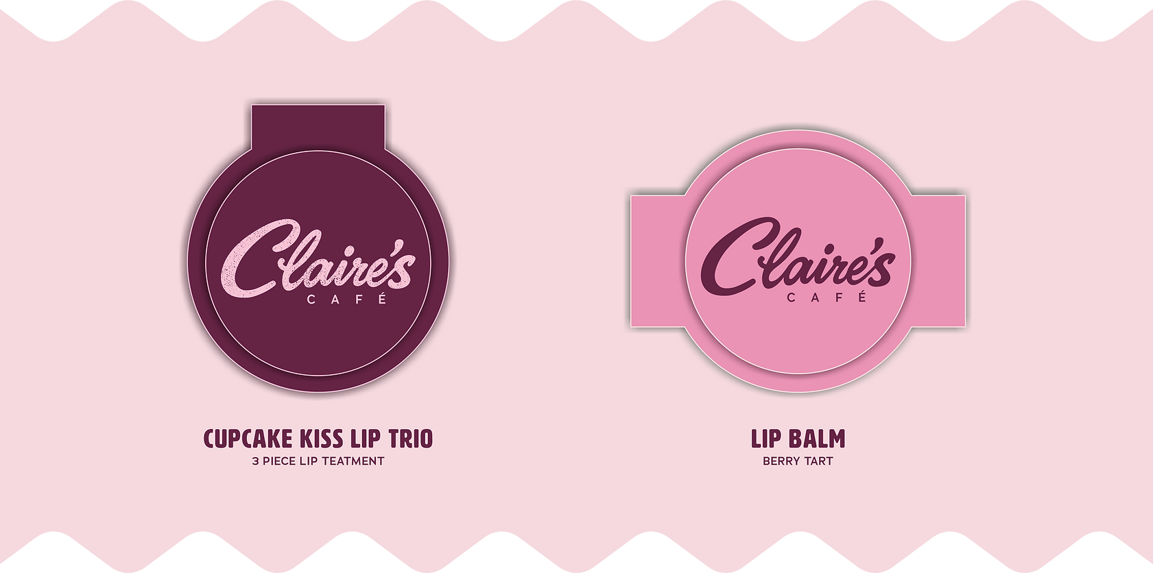
From lip balms and glosses to café-themed beauty accessories, each product is designed to feel like a small indulgence. The visual identity combines bakery cues with youthful cosmetic branding, creating a world that feels sweet, nostalgic, and playful while still being retail-ready.
As the Branding and Product Designer, I developed the concept, visual identity, packaging direction, product forms, color palette, and overall presentation. My role focused on translating bakery goods into a cohesive cosmetics system with strong shelf appeal, clear storytelling, and a memorable brand experience.
SERVICE
Branding & Packaging
CLIENT
Claire's
YEAR
2026

CREATIVE DIRECTION
I led the full creative direction from initial concept to final retail presentation. This included developing the product vision, visual language, color palette, packaging direction, and overall brand experience to ensure the line felt cohesive, marketable, and shelf-ready.
CONCEPT DEVLOPMENT
I developed the full product concept from the ground up, translating trend research, consumer insights, and category opportunities into a clear creative system. Each product was designed to feel current, playful, and commercially relevant while still supporting a strong brand identity.
RENDERING & VISUALIZATION
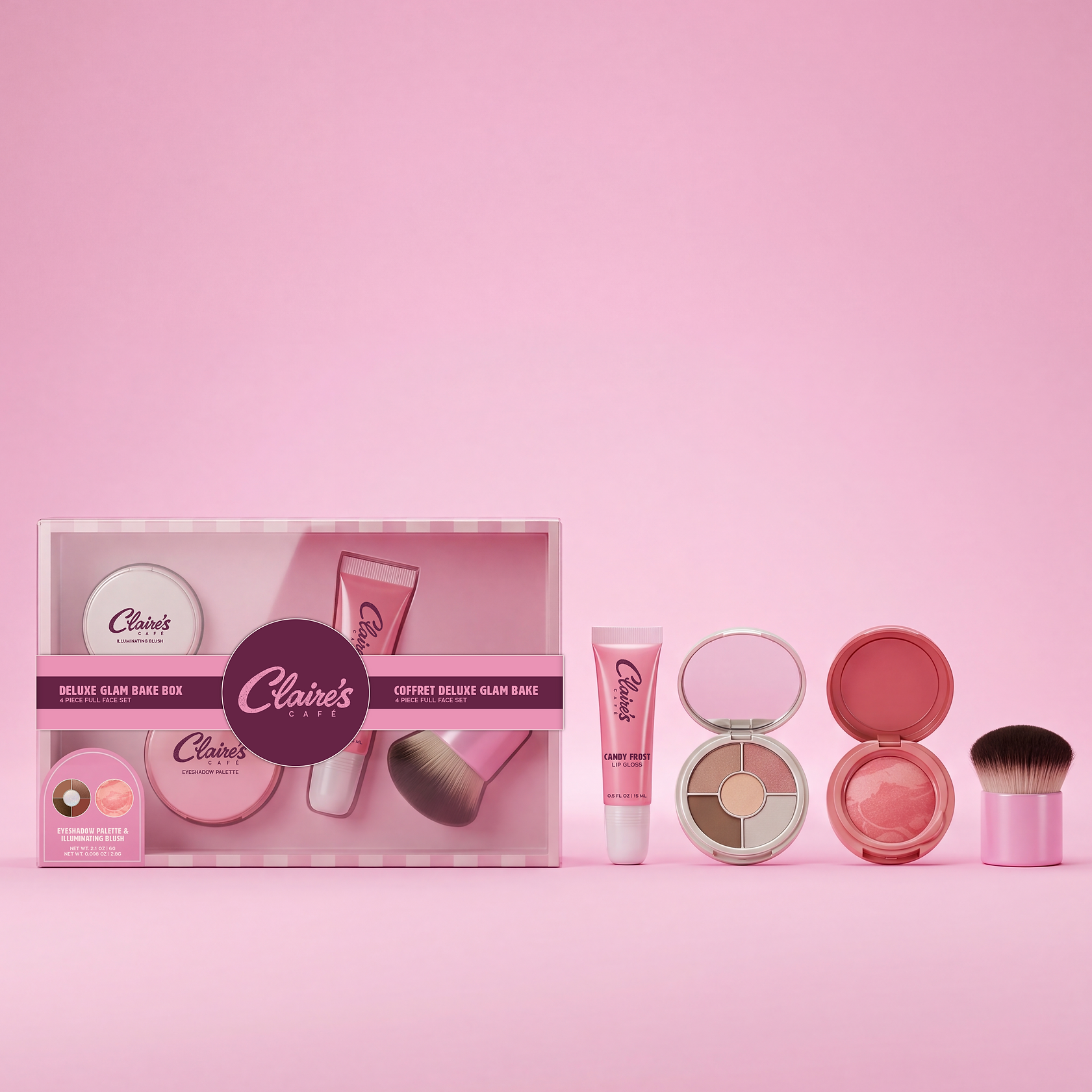
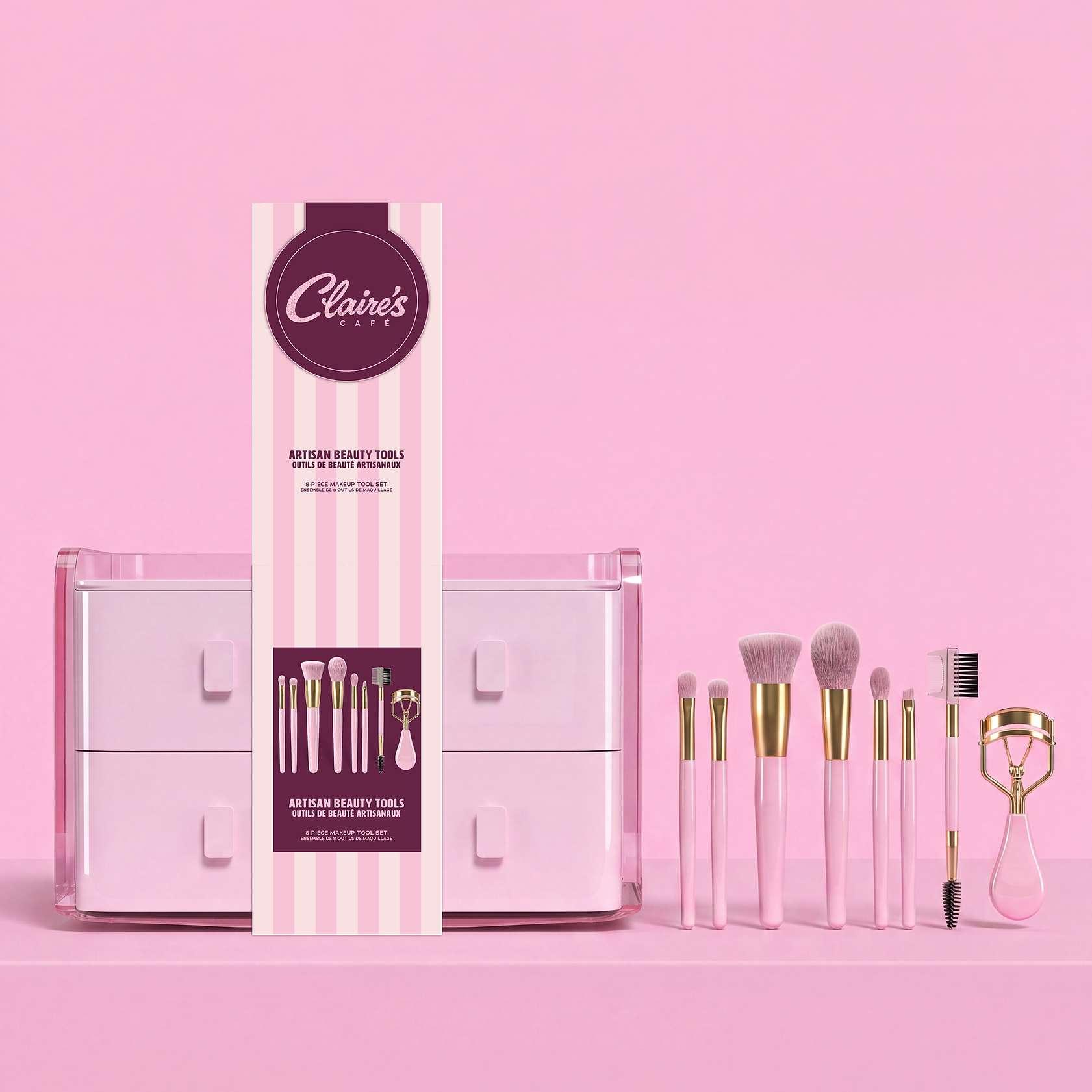
I created realistic product renders and presentation visuals to bring the line to life before production. These visuals helped communicate packaging structure, material finishes, color direction, and how the full collection would live together as a retail-ready assortment.
PRODUCTION & RETAIL
I carried the concept into production by preparing packaging artwork, refining product graphics, and supporting the transition from design approval to final shelf presence. My focus was to create a line that not only looked strong in concept, but translated successfully into a polished retail product.